

Poster plans
I created a few posters, each with something different, such as a logo or a completely different design.

This version has tear-offs along the bottom, as it's unconventional to have so much white space on a poster, I tried to fill space, so I moved the writing and logos and added in tags which read 'MISSING - www.rosie-is-missing.co.uk'.
This makes them seem more like the american style 'lost' posters I found. I didn't think this worked, as the tear-off tags aren't commonly seen in Britain, and would look out of place.
I really like this version, as it's simple, looks like a mssing poster (though the logos make it obvious that it's a film poster). I also like the fact it breaks conventions by having lots of blank white space, as this reflects the storyline of the film, (it's unconventional for an 18 year old to hand out missing posters for a doll).
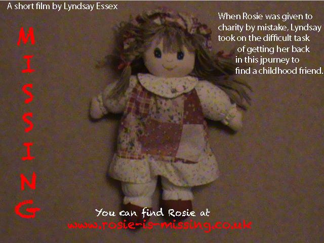
This is my least favourite version, as it doesn't fit the style of the film. I tried to fit with other film posters, using one photo to fill the whole poster, and overlaying the writing. Though due to the quality and size of the photo, it looked really unprofessional.
No comments:
Post a Comment